Learning Activity – Typography – week 10-12

1a) Define the term “typography” in your own words.

Typography is the use of letters and words and how they fit together with other elements so it’s readable. This is determined by font, size, space etc witch are all important elements to be considered so the design fits the message it’s designed for. There’s two sides to typography, macro and micro. Macro typography is the overall look of the design – layout, columns, space and how the text fits with images and other elements. And there’s micro typography witch is the choice of fonts, letter-spacing, line heights etc.

1b) Write a few sentences explaining what typography is not.

Typography is not text in artwork, graffiti, making of letters with elements like stones etc, handwritten letters and other random things like this.

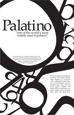
1c) Find a case study on typeface development on the Internet. Explain which medium the font developed is best suited for and why. Keep legibility, size and style in mind.

COMIC SANS designed by Vincent Connare

The first font I could name is Comic Sans. It’s also the first font that comes to mind when I think back to when I wrote my schools assignments and made large wall papers. It’s from the days when I could sit for hours and «design» the coolest titles using Microsoft Word’s 3D effects in Word Art. I remember that every note I got from the teachers was written in Comic Sans. Comic Sans was more used then Times New Roman, which was the default font in Word.

When I started my studies to become a Graphic Designer the first thing I learned from a large number of design blogs and articles is that Comic Sans is the worst font that has been designed and that it should never be used by a professional designer. Why is that?

1fde3_comic-sans

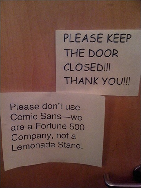
Comic Sans was designed by Vincent Connare in 1995. At that time he worked for Microsoft and that was the time when Microsoft designed computers which was ment to be in every home and every office all over the world. World domination. He was given a beta version of Microsoft Bob, a software designed for younger users. He reacted when he was that Times New Roman was used in the talking bubbles. It looked really out of place so he decided to design a more fitting font.

bobhint

He didn’t finish the design so it got released with the odd looking text. This font was mainly intended to be used in applications for kids but was in fact included in the Windows 95 Plus Pack. Later it was included as a system font and used in a program for making comics movies. Now it’s a system font for both Windows and Mac OS. When Vincent Connare is asked about why he think his font gained a such great success he answers:

Regular people who are not typographers or graphic designers choose Comic Sans because they like it, it’s as simple as that. Comic Sans isn’t complicated, it isn’t sophisticated, it isn’t the same old text typeface like in a newspaper. It’s just fun — and that ‘s why people like it.

So that is why. But does it work? Yes it works for what it was designed for, a comic book font. It’s actually quite perfect for comic books because of the childlike and bit handwritten look. But if you want to use it in a design or write larger texts the font faults. Ironically it has really poor readability because of the uneven design of the letters. The lines of the letters are uneven and some of the letters, like the «e» and «t» stands out from the rest of the letters. That makes the eye stop or pause for a bit when the text is being read. Also, the letterfit, kerning, is really poor. It all just looks very random. This fonts does not handle weight very well either. When weight is added the letters become even more uneven and random to look at.

comic-sans-sample_dezeen_ban

comic-sans-sample_dezeen_ban

If Comic Sans is dramatically sized up or used for a very small amount of words it works. But since it’s a very childish font it can be used for anything but childish messages or designs that are a bit unserious. It’s very hard to read in small size and in a large amount. It doesn’t work on screen or on small print. But it does work for what it was designed for, a program for children on a computer from 1995. It’s a shame that was included in Windows 95 because that ruined the font. Comic Sans was used by everybody on print and this is a font that was designed the be one screen back in the days when Windows didn’t have anti-aliasing. And that is why it got «hated». There’s even a movement now trying to remove it.

anti-aliasing1
See how the «e» get a dramatic change when aliased


3a. Complete the exercise files that came with the Lynda video Indesign Typography. Upload them to WordPress.

I did watch the entire thing and did all the excersises. It’s fair to say that I learned a lot and really appreciate these Lynda courses we have to watch! I haven’t uploaded the files because they are so many, but I did do them.

3b. Use your design software to design a newspaper front page. Pay special attention to typography (size, leading, column width, etc.).

I decided to copy Dagbladet because this is a newspaper that has a very complicated front page and doesn’t really look like a newspaper anymore. A challenge. I have left out a few design elements because I had to save some time. All of the pictures is from google searches.

a_01_l
This is the front page of Dagbladet I copied
avisforside_db
My result


3b. Use your design software to design a double-page spread (DPS) for your favorite magazine:

I don’t read magazines but I did before. So I decided to design a double spread for a interior magazine. When I did read magazines I especially loved the layout in the interior magazines because they are minimalistic and easy.

Learning Activity – Acquainting Yourself With the Work Process – Week 7

Consider the different steps in the work process and answer the following questions in writing:

1. Conduct research. Write down different means of conducting research. What do you think can be done to collect information and get consumers’ perspective on a proposed idea?

Good research creates the fundamental for your design. For your research to be of good quality you need to get information from various sources and angles. The more information you have the easier and better the design process will be.

First of all you need to sit down with the client and find out what the client wants. What do you have to work with? What kind of product? What is the goal? Who is the target audience? What is your budget? You have to figure out what the expectations are so you can meet them when you work out your strategy.

Next step is to conduct research. Search online. Find out if there is other similar products on the market. Learn about the competition. Find out about the consumers. Ask them by developing a way for them to answer a few questions regarding the product. You could get in contact with the store or business that sells the product and ask if they have some suggestions. Also, talk to the employees. They work with the product and the brand therefore they serves as the number 1 intel.

2. Clarify the strategy. What do you think should be included in a creative brief? As a designer, what would you consider vital information in such a brief?

  • Be sure to have the clients interest in mind at all time
  • Include their ideas and thoughts in the creative process
  • If the research have made changes to the ideas be sure to clarify that and explain why
  • Have a clear strategy when you suggest your design
  • Sort out what the long-term goals is
  • Find out what kind of message the brand wants to send
  • Be open for suggestions and changes
  • Keep in mind that your strategy always should be backed up by your research
  • Keep within the budget
  • As a designer you offer advice but the decisions is made by the client


3. Design the identityHow would you approach the findings from the research and the clarified strategy? What would your first steps be once you’ve received feedback and a brief?

It is time to get to the drawing board. I would not start anything before I have all the decisions and the strategy written down. This way I can revisit them at any point. If the client wants me to create a brand from the scratch, I would start by designing the design manual. This is the manual that visualizes and describes the brands identity. Everything from the logo, typeface, colors, sizes etc will be determined in the design manual.

If I was designing a product I would start by creating sketches to show the client. When my client have approved my sketches I would turn them into the final design. If the client added to the sketches I would do them over and present them for a final approval.

4. Create touchpoint. What do you think is meant by touchpoints? 

A touchpoint is where the consumer comes in contact with the brand. This can be a large number of things. Such as a billboard alongside the road broadcasting the new brand. Or a TV commercial doing the same thing.

Touchpoints is determined by the goals for the brand and what kind of platform the brand is launching of. For example, if it is a new online store it would be wise to create newsletters, website banners and put ads on social media. This way you can link directly to the website for your store.

5. Manage the assets. How would you nurture and grow the brand that you’ve created? 

First of, it is crucial to stick to the message and identity. Don’t change the brands identity along the way because this will just create distrust. That can be impossible to correct later. If the brand presents itself as healthy and environment friendly, don’t suddenly change by using unhealthy alternatives etc. That is a very effective way to lose credibility and costumers.

Many brands have used product placement in social media and entertainment in very effective ways to keep growing the brand. But, it is important to execute it in «hte name of» the brand. Examples:

  • Sponsor a celebrity close to the target group
  • Run small and large competitions that relates to the brands identity. Something like a sport competition for a sportswear brand.
  • Sponsor bloggers
  • Sponsor or be visible at big events, such as festivals and award shows


A large company will have many employees. They are all ambassadors for the brand so it is very important that they share the same goals and have the same care and affiliation. The employees need to feel a sense of love and respect for their job. Not only does it create a nurturing work environment but will also be one of the best ways to advertise because it is sincere and for free. If the employees isn’t onboard the brand will collapse from within and the rumors will reach the consumers by word of the mouth. No one wants to work for a company that  wont take care of their employees.

I speak from experience. I work for Dressmann. Everyone (2800 people) that works for the company says that they has the best job in the world. That can seem a bit weird for outsiders because it’s just a clothing store, right? Not just. What this company does, and the chairman especially is to work with the people on the floor at all time. This company is full of people cheering each others achievements and wanting everyone to brag of themselves. That is actually quite liberating! Dressmann has actually developed an app devoted for that specific purpose. Its ment for posting great sales, posting pics from the stores, see others achievements etc. It very much like Facebook, just without the back talking and envy. In addition to the positive work environment Dressmann uses a ton of money on internal competitions with huge prizes. There is «Store of the month» and «Region of the year» which awards money for a big social event or with a week-long trip to a warm country. Also, if you win «Store of the month» you receive a large golden trophy that is to displayed on the counter. In addition there is smaller competitions based on sales that has a variety of prizes. And there is 2-3 parties a year that just alone makes you want to work for it. I could go on for ever because there is a lot more but I think I have proven my point. Dressmann has the most loyal employees I have ever met and that is based on fun, really hard work and a bucket load of appreciation from the top of the company.

Learning Activity 07 – Having Fun with Brand Identity

1. Do you think the movie provides insight or detail into what drives product placement in entertainment? If so, what have you learnt from that? If not, how would you change aspects of the movie to reflect insight on this?

It was really interesting to watch because I wasn’t aware of how much product placement it is in entertainment. I guess we all are so used to it so we don’t really think about the amount we are exposed to. The movie painted a clear picture of why the brands needs to get their products embedded into movies and tv shows. Product placement generates a large cash flow easily by exposing the audience for specific products in clever ways.

What the movie showed me is how unnatural it really is but yet I haven’t noticed it that much because it is always there. It is safe to say that I will notice product placements from now on. I think the movie was a eye opener and did provide a great insight into product placement.


2. What have you observed about presentations of visual strategies/brand identity?

The brands/companies is very particular of how they are being presented and with whom. It is all about reputation and that is difficult because reputation is a fragile state that easily can be harmed.


3. Let’s consider this movie as a form of research. In other words, it was done to see what the effect of branded entertainment would be, a case study of sorts. What are your findings? What have you learnt? What has changed your pre-conceived ideas? Do you think there’s relevance in this case study? How could you apply your observations in real life?

It did change my pre-conceived ideas, because I did not know so much about product placement in entertainment to begin with. All I knew was that it is a lot of it. It was interesting to learn how much money that is involved and how much power the companies has in the entertainment industry. Almost everything we watch today is sponsored by large brands and therefore they control a large amount of what we can and can not see.

I am very critical of what I eat because I have learned that almost everything we buy is full of sugar and other added supplements that is bad for us. I don’t trust the packages that says that the product is sugar free because the sugar always is replaced with something else to make the product taste sweeter. Lets face it, if our food wasn’t full of sugar and fat we would not eat it. We are all addicted to it. So, since I am already aware of my food I could easily be aware of what I watch.


4. Imagine that the international coffee brand, Starbucks, is your client. Give one complete strategy for a small activation campaign to advertise Starbucks on airplanes. Give one idea of how you would do this, by following the 5 steps of the work process. 

A. Research:

Quick read at their website: Starbucks opened in Seattle in 1971 as a place for people to drink coffee and relax. 10 years later Howard Schultz (chairman of the company) got inspired by the Italian way of coffee and wanted to bring that back home. Starbuck is meant to be a place for people to drink coffee, relax, work and meet friends. Today Starbucks is a large company with 22,519 stores all over the world. It is safe to say that everyone know about their coffee.

B. Clarify the strategy :

The idea is not to change anything of the brand identity but to create a new and short advertisement campaign targeting tourists traveling with american airplanes from other countries. The goal is to get the tourists to pay a visit to the local Starbucks when they arrive to their holiday location. Campaign is set to the 3 largest tourist months during summertime.

  1. Designing a small pamphlet on Starbuck as a company and their best products as well as their own souvenirs. The pamphlet will be in the pocket on the back of every plane seat.
  2. A free small paper cup with the top selling coffee/tea given out to everyone on board. The paper cup will have a recognizable and memorizable design.
  3. Selling three different Starbucks souvenirs at the airplane. The three items will be shown in the pamphlet and available for purchase on the way home.

B. Design the identity:

Suggestions for a design for the coffee cup, pamphlet and voucher:

Starbucks

C. Create touchpoints:

  1. The consumer should be aware of Starbucks the moment they take place in their seat because of the pamphlet in the pocket in front of them. Here’s the chance of getting to know the company and the products. The intention is to spark their curiosity.
  2. Already aware and curious the coffee/tea will be served. The paper cup will be clearly marked with logo and a fresh design. This should be enough for the consumer to want to go to a Starbucks to buy a coffee.
  3. On the plain ride home the pamphlet will still be in the pocket. The consumer gets the chance to buy a Starbucks souvenir. If the consumer was visiting New York, Las Vegas or Los Angeles he/she gets the opportunity to buy a specially designed souvenir for these cities.

D. Manage the assets:

Inside the pamphlet is the possibility to get a voucher for 20% discount in a Starbucks store that can be used during their stay in USA. They have to register their email and a code from the pamphlet on the website. In return they get a voucher on email. This creates the opportunity to send newsletters and a really quick email a with couple of questions. The questions will be about their stay in USA and their visit to Starbucks. In return they will receive a email with a 20% discount at a Starbucks where the they live. If it isn’t a Starbucks in their country the voucher can be used in the webshop. This would keep their future interest.

Learning Activity 06 – Workflow and Backup

1. Draw a diagram of your preferred workflow and explain why you take certain steps:

After watching the video lessons for this week it’s clear to me that my workflow is really backwards and time-consuming. I have never used Bridge for organizing and editing my photos. I really thought Photoshop was the most efficient choice, but I see now that you can do the same things in Bridge a lot faster and it is way easier to keep track of my files. So from now on this will be my new and improved workflow. I drew a diagram of my old workflow for this exercise.

workflow

2. Create a checklist for your workflow:

  • Import to computer
  • Sort, arrange and create structure
  • Edit in Photoshop
  • Save to preferred format/formats
  • Backup
  • Publish/email/deliver


3. Take a screenshot of your folder structure:

Skjermbilde 2016-05-30 kl. 10.45.56Skjermbilde 2016-05-30 kl. 10.49.43

I don’t use finder very often because I have organized all my files in 6 different folders with their own color assigned to them on my desktop. That is what makes the most sense to me after I have tried different ways of organizing my files.

4. Explain why creating backups are so important:

I learned this the hard way. I had almost finished the portfolio for the first year of GRA when I had an accident with my laptop. I hadn’t made a backup of my work so as a result I had to push the deadline and work twice as hard. And because of the lack of time the portfolio wasn’t as good as the original. That was really stupid, but I did learn to always to do backups of my work.

If you don’t have a backup ypu can loose your work permantly. You never know if your computer will be stolen, break down or your house will burn down. Although it is a bit dramatic, it is a good idea to prepare for ther worse. I also believe it is even more important to keep two backups. One at a harddrive and one backup online, for example in a cloud. Because if your house burns down and that is the same place as you keep your computer and your backup harddrive your files will be gone forever.

Learning Activity 05 – Planning A Fashion Shoot

Planning a fashion shoot

1a: In your own words, describe the procedure of planning a fashion shoot:

To have a successful photo shoot you must have a solid plan. Planning is the key. First of you have to lock down the concept for the shoot. From there you can set up mood boards, draw a storyboard, book a location and hire models, stylist and other necessary crew. For the stylist to do her/his job properly it is important to communicate what the concept is, how the model should look and how you want the pictures to be. The rest is the stylists job.

Make a list of what equipment you need and make a time schedule. A time schedule is important because everybody on the set should know how much time they have at their disposal. Also, it is expensive to work overtime.

1b: What are the stylist’s duties?

The stylist is in charge of props and clothes. That includes finding clothes that fits the model and concept, make sure that the clothes arrives to the set at time, match props and clothes and manage costume changes. Also, the stylist is always on point of the latest fashion so it is a good idea to meet with the stylist before the shoot.

1c: List your duties as photographer:

First of, the photographer does all the planning and preparations before the shoot. As the boss on set it is the photographers job to make sure that the shoot is a success. That includes hiring crew and making sure that they do their job, setting a time schedule and making sure that it all goes according to the plan.

1d: What equipment would you take along on the Alice in Wonderland shoot?

  • Camera with lenses
  • Battery charger
  • Memory card
  • Lights
  • Light box
  • Music

1d: Find an editorial fashion spread in a fashion magazine. Explain what you think the concept was, what equipment they used and how the location affected the concept

IMG_1957IMG_1956IMG_1955

This is a fashion spread from ELLE may/june 2016. The concept is «Surfers Paradise». It isn’t necessary to read the title to get the concept for this fashion shoot. The location is on the beach and at a beach house with a surf board, light white fabrics and a hammock in the background. The model is dressed for warm weather with bikinis and other summer clothes. Also, her hair has that blonde messy  dried salt water look and almost no makeup on so it looks like she has been at the beach all day.

2. Recreate the «Snow White» photo shoot:

Concept: Grown up story/fairytale

Location: House with a garden/wood

Crew: Stylist and model

Equipment: Camera, reflector, battery charger, memory card, lights, necessary props for the shoot

Time: 09:00 for approx. 6 hours

Shots:

  • Outfit 1: In front of the front door to the house holding a white rabbit
  • Outfit 2: Lying at the ground in the woods with leaves all over
  • Outfit 3: Sitting on a chair holding a teacup
  • Outfit 4: Sitting in the grass with the white rabbit in her lap

CCI30052016_3


fashionmoodboardhairmoodboardmakeupmoodboard

Timeline:

09:00-10.30: Hair and makeup. The makeup will be the same, but the hair needs to be changed into a few variations. Fitting of clothes.

10.30-11.00: In front of the house with the rabbit.

11:00-12:00: Change of clothes and hair. In the grass with the rabbit.

12:00-13:00: Change of clothes and hair. At the table holding a teacup.

13:00-14:00: Change of clothes and hair. In the woods lying on the ground.

Sketching Techniques

1. Define, in your own words, the printmaking terms.

bewick_thomas_barn_owl_tyto_alba


Wood engraving:

This is a letterpress printing technique developed in the 15th century for printing words and book covers. The artwork is carved out of a woodblock and filled with ink.


img_5887


Linocut:

This is variation of wood engraving developed in the early 1900’s. The artist used linoleum to carve out the artwork, which was much easier to use since it did not split and was not as hard as wood. But it was a bit harder to create large-scale artwork since the material was more fragile.


d5994b7b3de1af56d3ffe49ae4c0ecb0


Drypoint:

This print technique was first used in the 15th century. The artwork is «scraped» into a copper plate (or acetate, zinc og plexiglas used in modern time)  with a sharp needle of metal or diamond. Like linocut and wood engraving, the image is filled with ink. But in this case the amount of ink i carefully added because of the fine lines in the engravings.


rembrandt_aux_yeux_hagards


Etching:

This is also a old printmaking technique from ca 1515. A metal plate is covered by wax. Then the design is scratched out by a pointed needle. For the design to appear the metal plate is washed with acid. The acid removes some of the metal and leaves a smooth surfaced that becomes ready to be inked.


english-fine-scroll-practiceEngraving:

This is actually a method used by humans as far back as we have excisted. The method is simply that the artwork is carved out of hard material, such as rock, metal, copper, glas etc. The method has been redefined many times over the years and is still used today by engraving machines, goldsmiths, glas engravers etc. But for printmaking the engravings was filled by ink and pressed. It was a difficult technique to learn so it was replaced by easier printmaking methods.

bf41f92dc17402f25dc247d2bba0183a


Lithography: 

This method was invented in 1796 as a cheap way to print. The artwork was painted directly with wax onto a pre-prepared stone. When the ink was applied it only stuck to the waxed areas, creating a negative image. Then it was printed directly to a sheet of paper.


sailor-with-tattoos


Screen-printing:

A stencil, that containes the artwork, is created by block of the areas that is ment to be free of ink. In other words, the artwork is created as an negative image. The stencil is placed under a screen made of fine silk. Ink is poured on the screen and pushed through by a blade made by rubber.


degas


Monoprinting:

This is a unique technique because the artwork is painted onto a glass plate and printed directly on paper. Since there’s no engraving or permanent marks the artwork can not be reproduced as a exact copy of the previous print and therefore makes every print unique. This also gives the artist the opportunity to play around with the artwork.robertshunter-hearnoevil-digitalprintmaking_5-13


Digital printing: 

Digital printing technology is used in innovative ways to produce limited edition, digital fine-art prints.


2. Use your graphite, eraser, eraser putty and blending stub to sketch spheres using the following techniques: hatching and cross hatching, blending, rendering, squiggly lines and cross contour lines. 

SketchingTechniques

3. Find a poem that inspires you and illustrate your poem.


Før du ble unnfanget, var du ønsket
Før du ble født, var du elsket
Før du hadde vært her en time, var jeg villig til å dø for deg
Slik er kjærlighetens mirakel

PS: Illustrasjon kommer. Det har vært en veldig lang uke uten noe tid til dette desverre)

Learning activity – Graphic Design History

Learning activity – Graphic Design History

Graphic design is the art of combining text and pictures/illustrations into advertisement, print or screen based designs. Graphic design has its roots in art and is today both a profession and an art form. Although graphic design started before the 19th century it did not really grow until the 1920’s in Russia with the Constructivism movement. That is when the ideas of designing with a purpose was born. These ideas had great influences on many art forms, such as architecture, graphic and industrial design, theatre, film, dance and fashion.

De Stilj

De Stilj is a movement influenced by Constructivism. The artist worked for simplicity by reducing their designs to geometric forms and primary colors. The idea was to bring order and harmony to the art form and also into the society.

Piet Mondrian’s «Composition with yellow, blue and red» has become a very known design which you can reconize in its true form in all types of designs today. This is the movements main ideas in it’s true form.

composition-with-red-yellow-and-blue

The Rubik’s cube is an obvious and clear example of Piet’s design in use today.

2000px-rubiks_cube-svg

microsoft_new_old_windowsdesign-dictionary-de-stijl-fashion

6-de-stijl-style-living-room

The Bauhaus

In 1919 Walter Groupis started the art School Bauhaus in Germany. The school became the birthplace of a movement later called the Bauhaus. This is where many of the ideas we use in graphic design today was formed. The school focused on functionality, simplicity and they believed that art and mass production could be combined. Form follows function! Also, the school was a major contributor to developing sans-serif typography. They believed that Germany standard of Black-letter typography was to heavy opposed to the geometric and simple forms of sans-serif.

This is a design from 1920’s with q consistent use of geometric form and typography combined with a simple color palette.

bauhaus1923

t-banen-linjekart-03042016

When I think of Bauhaus I always think of interior. Interior design has been influenced by The Bauhaus for a long time and for that period of time a lot of famous furniture design has been made.

furniture-design-by-mies-van-der-rohe-homesthetics-13

3dr-chest

Swiss Movement

Simplicity, easy reading and objectivity was the founding ideas in Switzerland in the 1940’s which later has been called the Swiss movement. This is also the time that has been known as the International Typographic Style. That is because the typography had a renaissance and the designers developed a lot of new fonts, and most of them being used today. This movement was led by Basel School of Design and Zürich School of Art and Crafts. They focused on poster design and combining typography and photography.

1955 Beethoven poster by Josef Müller-Brockmann, a design being copyed often today.

c21e9f46416eb03c02bb3985d5d8f9f0

1705460f48a4952eb3ca01b34327782dswissted-fake-swiss-posters-01100chgrafik_3

gavin_potenza-11