The assignment is to design an online infographics about eras of art; Abstract
Expressionism, Pop Art, Swiss and Psychedelia. Every element of the website
has to be self produced as the copyright act prohibits me to use materials
that others has produced.
I have designed an infographic website using an element of my choice to
present 4 different style eras. The design eras is Abstract expressionism,
Swiss, Pop Art and Psychedelia. The element will change as it travels through
time and inform about the different styles in question.
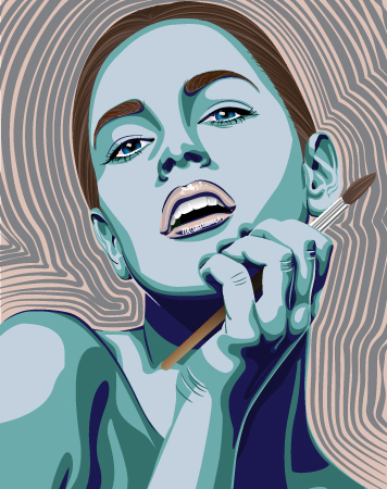
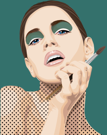
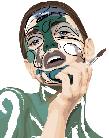
I have created a fun and really colorful website for kids at High School. Art history isn’t very interesting to most kids so I have made sure that each page is purely dedicated to the art era with a tailor-made design and a unique portrait. The woman is meant to be a fun and interesting interpretation of a painted canvas. The portraits will also give a strong idea of how the artwork where of that time.
Publish a résumé and covering email as if you were applying to work at a real company.
I am not finished with my resume. I still want to draw a vector portrait of my self in Ai and add icons to the «Contact» section and «Special Skills» section. I will do it when I’m done with MA08.
1. Set up a meeting with a business owner and ask him/her what he/she would want from a website. Also ask him/her what the business strategy is and how the website would fit into it. Then write a detailed document about this.
Charlotte Celius Bjørvik is a fine art artist from Norway. She creates beautiful watercolor paintings, detailed graphite drawings of animals and people, fashion illustrations and surrealistic ink drawings. She needs a website that shows her work in a portfolio, describes her and her work, has a option to buy artwork and is connected to her social media accounts. She also wants to have the opportunity to upload work her self.
Charlotte wishes the design to be in light color shades, preferably white. This will match her artwork better and emphasizes the colors in the paintings. She wants a clean design with a lot of free space.
Her portfolio needs to be divided into categories because of the various artwork. She doesn’t want small thumbnail sizes, but a scroll down page for every category with a three images per row and the name of the artwork beneath.
She wants a separate page with bio, her artistic visions and a list of her exhibitions. Almost like a resume.
A row with social media button in the header so they always are at the same place and accessible on every page.
2. Use the information from this document and create a website architecture.
Website architecture
Webdesign for screens over 1024px
Design for mobile screens
3. Now let’s focus on the web design strategy. Your document should justify all the major decisions you make – from the domain registration, hosting, design and target audience through to what you decide in terms of programming.
She is one of ten thousand of artists that tries her best to be visible in social media. Its a brutal and extremely competitive market that is based on the ability to self promote and being accessible. Its common for every artists, hobby based and professionals, to have their own website and a online store. Its my job to design a website that makes her look professional and more desirable then the other artists. The domain will be her name because that is what her followers know her by. I have chosen one.com as hosting service because they have fair price, backup and enough space to store all her images included in the price. They also provide hacking security and other useful extras for a fair additional price. I have talked with her about the importance of including her website address in everything she does. It should be in the bio of her social media accounts, it should be included in her emails and it should be included in the text of everything she posts in social media. I also recommended her to print up business cards with the website address in focus.
I will set up the design in WordPress and design it as a WordPress theme because that gives her the ability to manage her own site and it’s easier to design as a responsive site. The biggest amount of her followers uses a phone sized screen and therefore it has to be adjustable.
The color palette will be very light, white with light shades of min green. It gives the feeling of air, early morning breeze and freedom. Its a color palette that don’t interfere with the artwork and is pleasant to look at for most people.
The header will be of a larger size and thats where she will display her proudest artwork. The header will serve as a teaser for the portfolio, so the image will change for every page. The main background will be in the whitest shade. The header will have next color, the lighter grey. Links and menu will be in green colors as well as titles and names of the artwork.
I want you to take on a client. I then need you to have a meeting with your client and create a very detailed brief. This brief should contain all the information that will be needed to achieve the client’s requirements.
Client brief
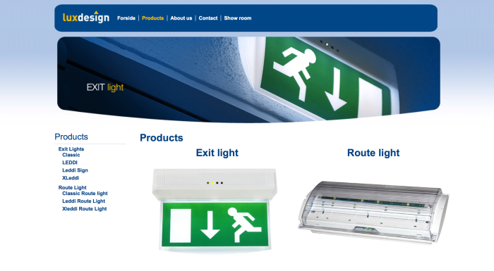
Luxdesign
The client is Luxdesign, a two-person company based in Drammen. They provide emergency lights and leading lights to other companies. The products are designed and produced by Luxdesign.
▪ What is the client’s service/product?
Luxdesign design and produce emergency lights and leading lights. They sell them to other companies which install them at public places and buildings.
▪ What are their requirements?
Their current website is out of date, both design and content. They want to keep the sites functions as they are, but it has to be made easier to get the information and easier to update. As the site’s main purpose is to provide information to current costumers it’s crucial to update the content and come up with a more use friendly website. Their target group is handymen from 30-60 years old and entrepreneurs in the same age group. Internet and website browsing isn’t necessary their greatest skill.
▪ What is the website’s goal?
The client wants to attract new customers but the main goal is to provide information. They use the website to show what kind of products they offer in addition to pdf’s with installment instructions and pdf’s with all the technical aspects of the different products.
▪ How are you going to achieve this goal?
I will use the current design as a basic foundation, but I will simplify the design drastically. I will change the navigation by creating logical submenus and remove a lot of unnecessary menu items. I will remove old products and update with new content.
The design will be simple and effective. The goal is for the visitor to use less then 3 seconds to navigate their way to the information they came for. To achieve that I will stick to the traditional website construction and remove unnecessary design.
▪ Build the website architecture
Current websiteQuick Photoshop Mockup
▪ What is the design style that will be required?
There isn’t a specific style. They wish to keep their current «look». It’s a bit 90’s-ish now so they want their business style to be more up to date. It will still be as clean and simple, and they want to keep the blue color palette.
▪ What are your suggestions for marketing the site?
As they doesn’t want their website to «sell» products and attract new business, I suggest that the website is at the least search engine friendly. If they have the budget for it I would suggest to pay in order to get on top of the search engine lists. They would benefit greatly if the website came up as a top search when someone search for emergency lights and similar.
These two are men at 50 and 60 years old. They are not interested in handling social media and blogs. What they need is a tailored fit package with Google’s business solutions and maybe a pre designed ad with a paid placement on Facebook or Instagram. They need a solution handled by a marketer which they just can pay for without having to anything else. As I understand they have enough customers as it is and really just want a website they can use as an information tool.
Diamond Awards is an annual award show, where students of Noroff are honoured with category nominations and wins, based on the work they have produced during their studies. Diamond Awards needs an animated opening title sequence. The title sequence will present the studies of Noroff in an exciting way, and will end with the Diamond Awards logo, preferably animated. There must also be sound included in the title sequence, which the students obtain the rights to.
The categories presented at the Diamond Awards are:
Graphic Design
Film Production
3D Design and Animation
3D Games
3D Film
Sound and music production
Technical Design DAK 2D/3D
Goal and visions
The title sequence for Diamond Awards will set the mood the award evening, and show the creativity of the students as well as their high level in production.
Market and target group
Students and teachers of Noroff, and invited guests, mainly visiting from creative businesses. The task is complex, and demands thorough planning. The goal of this assignment is to learn the fundamentals of motion graphics. Even though the end result it is important, it is vital for the project to focus on the entire process. The report must also contain references to your research.
I have made a title sequence which present the categories in a humorous way. I have sticked to simple and effective animations of the words and letters, and created recognizable references to the individual categories. Instead of creating a story I followed the traditional way of an award show with my own little twist. Basically, it’s the letters that actually presents the categories by transforming into shapes.The title sequence will be seen by students and teachers at Noroff and invited guests. So for me it was important to create something that didn’t offend anybody but make them proud of the profession they have selected as their own.
Animation and After Affects is a new experience for me so I had to spend alot of time learning about it. I have completed a bunch of training courses at lynda.com and they have been very inspiring to me. It was very cool to see how small variations to an animation made huge differences on the outcome. It’s clear that the designers that I watched has years of experience and can do amazing things in Ae but they explained everything perfectly and managed to make me excited about the assignment.
If it was up to me I could have made a much longer animation because I had a lot more ideas. But I understand that it has to be no more then 30 seconds for its purpose. I really enjoyed playing with Ae and I will definitely try stuff on my own. I have only dipped my toe in the water for this assignment so I am very curious to see what more I can do. I felt frustrated at times because I didn’t have the skills to create as sophisticated animations as I imagined them in my mind. But overall, I had fun and really like what I have created!
I decided to post two versions of my animation movie. The first version is when all the animations is completed and but together. I spent many many many hours tweaking it all in place and timing every movement. This version is without music, sound effects and the background animation.
This version is the final product completes with background animation, sound effects and music.
2. Now you need to come up with a unique animation concept of your own. Create a storyboard for this concept.
3. The next step is to create the file and folder structure. Please take a screenshot of your folder structure and hand it in along with your project.
4. Create your animation in After Effects.
I didn’t follow the storyboard as neatly as I should because I decided that I wanted to play with adjustment layers instead. Anywhos, here’s my version. I could had added much more effects to this but I couldn’t spend more time on the assignment. I still have a lot more to do with the mandatory assignment.
I decided to do a inspiration post for MA 07. I wanted to add animated inspiration and that’s just easier to do here then adding several links in the report.
Create a character. This character can be a letter, a person, an animal or any type of illustration, use your imagination. This character will play the main role in your animation. Take this character and draw it in five different exaggerated poses. In each of these poses the character has to express some kind of emotion (like love, anger, dislike, distaste, happiness and so on). Keep the animation principles in mind when you draw your character.
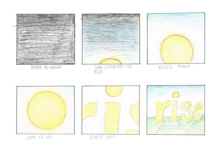
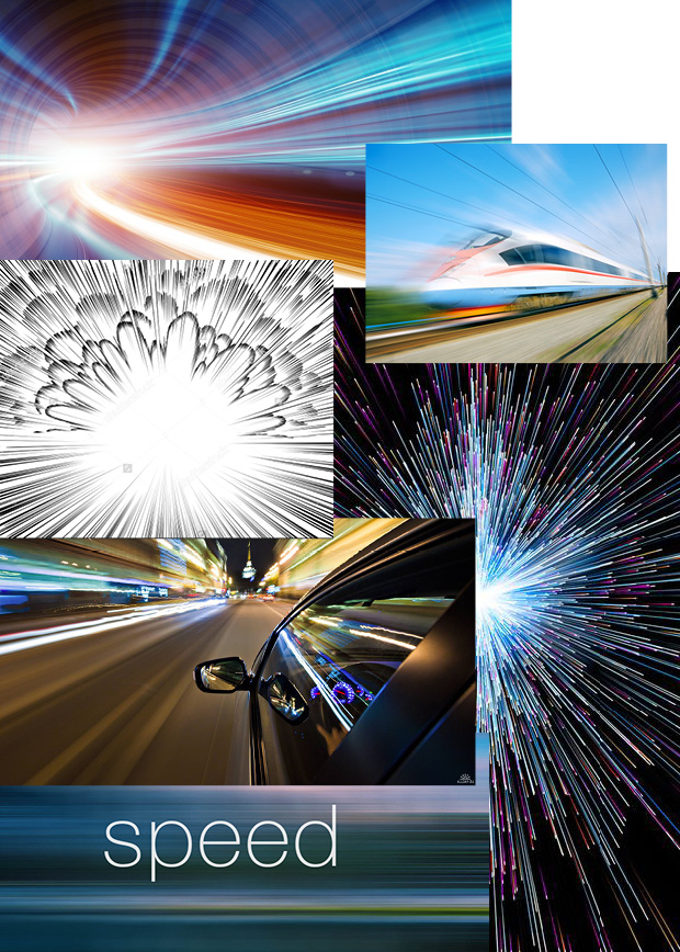
I would like you to create a mood board and storyboard using a word and its meaning as the concept. For example, you could use the word “prop”. You could then use the “r” to prop up the “p” that keeps falling over. That’s just to give you an idea, be creative and use a word and concept of your own.
I chose the word speed and this is the moodboard I created for the word.
If the idea is at the heart of everything, then I would like you to think of a movie that you love. Then look at its current title sequence and come up with a new one. Sketch up the rough idea in the form of a storyboard. Your storyboard needs to be at 30 frames and should be for at least 1minute of motion design
I chose to make a new title sequence for «The Jungle Book». I went a bit overboard with the coloring and spent a bit to much time with this assignment, but I just had to much fun.